Redesigning equity management for 350,000 employees, cutting support tickets by 32%.
A guidance-first redesign of Qapita's employee portal, so people could act on their own equity without filing a ticket.
Product designer. Led the redesign, research through ship
Solo designer · 2 PMs · 6 engineers · 2 customer success
Oct 2024 – Apr 2025
Web app, employee equity portal

The situation
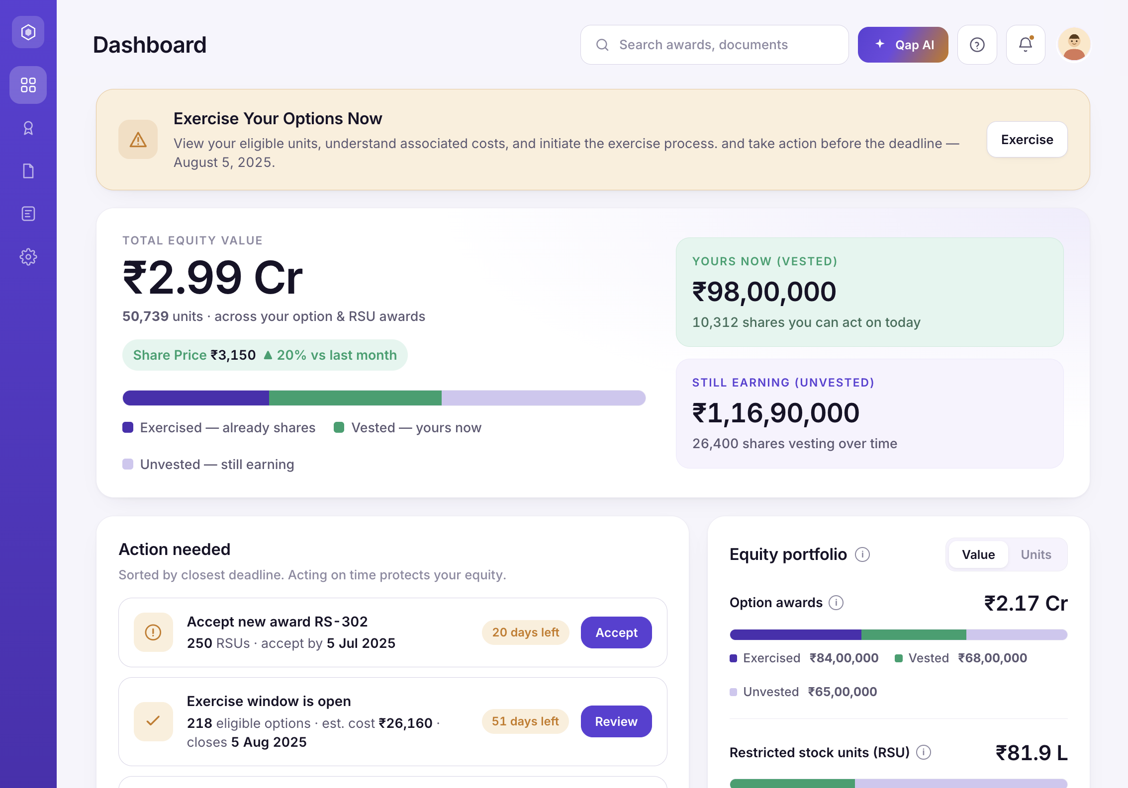
Qapita is an equity management platform for companies across APAC. Two products share one data model: an admin platform where companies run cap tables and ESOP plans, and an employee portal for them to see what their equity is worth and act on it: accept a grant, exercise options, settle, pull tax documents.
For most employees, the portal is the only window into a meaningful slice of their pay. When it failed to explain itself, the cost was concrete: confused employees filed support tickets, volume climbed with every new customer, and support cost scaled with the business instead of flattening. The mandate was blunt: make equity self-serve, so the company could grow without growing the support desk.
Research
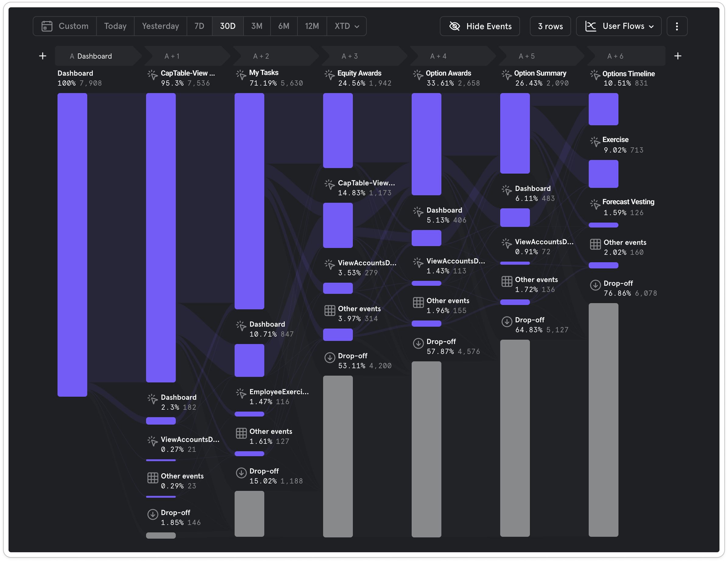
I triangulated four methods so the redesign chased real behaviour, not opinion, and so I'd have a baseline to measure against after launch.
The complication
The research pointed at four problems. None of them were about pixels. All of them ended in a support ticket, which made the ticket queue both the brief and the scoreboard.
Low literacy of the financial domain
FMV, strike price, cliffs, settlement windows: a four-to-six-figure decision wrapped in jargon employees had never been taught. In interviews: "I wasn't sure if I was even eligible to exercise."
No visibility of processes and events
Vesting milestones and exercise windows passed unseen. Employees were missing valuable, time-boxed opportunities simply because nothing surfaced them, and no support agent can undo a missed window.
Difficulty making financial decisions
Even people who understood the terms froze at the moment of commitment: no way to see the tax, the cost, or the payout before pulling the trigger on real money. So they asked a human instead.
No ability to configure the account
One rigid view for everyone. No control over dashboard widgets, and no way to set currency or date, time, and timezone formats, so a global employee base read its own numbers in a stranger's conventions.
The work
Four moves carried the resolution. Each started from a business problem, not a screen, and each one exists to take a reason to file a ticket off the table.
Put the explanation inside the interface
I built an onboarding flow that walks people through new functionality and interactions across the platform, and attached info popovers to every financially heavy term (FMV, strike price, settlement) so the definition appears on hover, exactly where the confusion is.
Why: the interviews showed people didn't fail at operating the UI; they failed at understanding what it was asking, and Mixpanel put the biggest drop-off right where understanding ran out. A ticket was easier than a help-centre search. If the explanation lives at the point of confusion, the ticket never gets written.
Make processes and events visible
Employees had no visibility into the processes and events happening with their equity. I solved this through three functionalities: a timeline for each award showing its full history and upcoming events; a dedicated dashboard widget surfacing upcoming equity events; and personal notifications sent via work email and phone messages to inform employees about upcoming events such as exercise and surrender windows, and buyback offers.
Why: for a product people open only a few times a year, the events that matter most were happening off-screen. Putting each award's history and what's next in one timeline, promoting what's coming to the dashboard, and reaching out proactively means nobody misses a window or a buyback because they didn't happen to log in.
Help users decide before any financial action
Three connected tools sit in front of every transaction. A Simulator lets people rehearse an exercise or settlement (set assumptions, see tax, cost, and payout side by side) before committing. QAP AI reads the account's own data and surfaces insights ahead of each financial action. And a chatbot answers questions about their data or gives advice grounded in it.
Why: the most common pre-ticket question was a version of "what will this actually cost me?" Verbatim: "I wish I could check the tax and payout before actually exercising." A rehearsal space plus AI that speaks to your own numbers turns that anxiety into a self-served answer. It also filled a competitive gap: rivals underserved tax simulation, especially across APAC markets.
Give people control of the account
I made the dashboard configurable, letting employees choose and arrange the widgets they care about, and added user preferences for currency and for date, time, and timezone formats.
Why: a global employee base was reading its own money in a stranger's conventions, and a rigid one-size view forced everyone through the same clutter. Letting people shape their own account is cheap to build and removes a whole class of "why does this show the wrong currency / the wrong date" confusion before it reaches support.
Try it yourself
An interactive walkthrough of the redesigned portal. Step through the flows the way an employee would.
Where I was wrong and adjusted
Not everything that surfaced in brainstorming earned its place. I dropped directions that didn't map to the four problems, and reversed at least one decision when the data disagreed with me.
Single-page exercise flow → guided wizard
I first planned the exercise and surrender flow as a single dense page, fast for a power user. But the usage data was clear: most people transact only a few times in their entire lifecycle, and they take considerable time deciding. Speed was the wrong target. I rebuilt it as a guided wizard, one comprehensible step at a time, so the interface eases the decision instead of rushing it.
Auto-acceptance → keep acceptance a deliberate moment
I initially assumed accepting an award was an unnecessary step and considered auto-acceptance instead. Talking to users and stakeholders made it clear this was the wrong direction. Acceptance may look like a friction point, but it's one of the most important moments in the award lifecycle: it's positive reinforcement that the employee has been given something meaningful. Some employees also deliberately delay accepting to plan their vesting schedule in advance, timing acceptance to manage financial gains and capital gains tax.
States, not screens
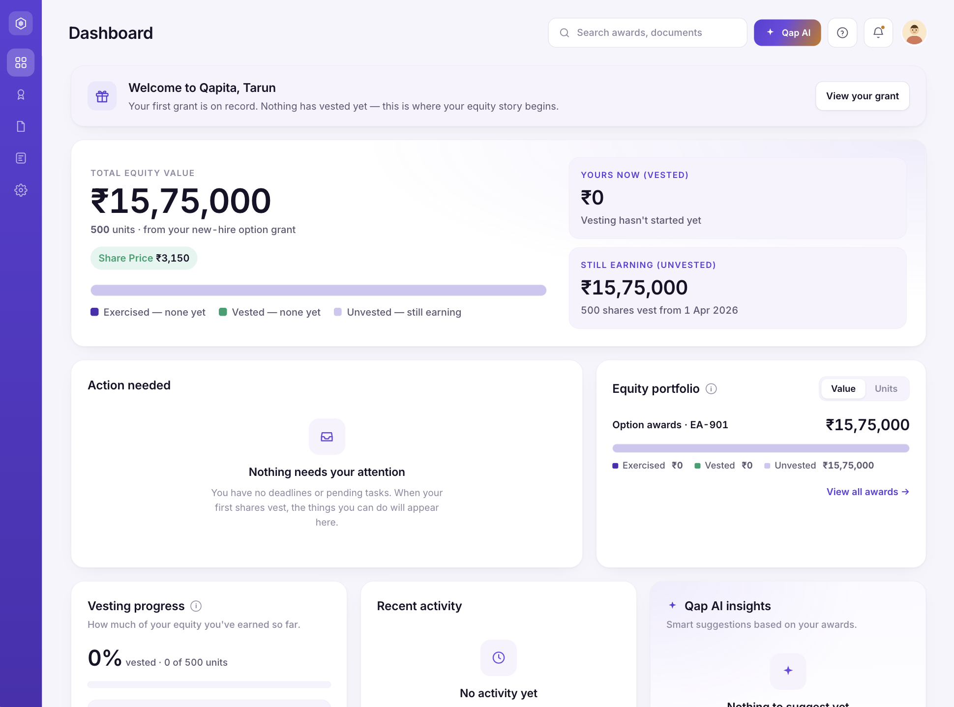
Beyond the exercise flow, I designed every key surface as a set of states rather than a single happy-path screen. For a product people open maybe twice a year, at emotionally loaded moments, the state they land in is the product. An unhandled empty or error screen is where trust and self-service break, and where a ticket gets filed.
Tradeoffs: the hardest decision
The personalised learning centre. My design tied education to each employee's actual situation (what you'd see about vesting, tax, or settlement depended on your grants, your stage, your market), surfaced at guidance touchpoints across the platform. Product was aligned with me; engineering pushed back on two fronts: limited team bandwidth and concerns about the data dependencies the feature relied on. I made the cut: the learning centre shipped as a plain section of generic videos, identical for every user. That protected the launch window and kept engineering on the guided exercise flow (the thing actually driving tickets), but it meant shipping education I knew was weaker. The personalised version now sits on the roadmap as a next-phase item, which is the right place for it.
Results
Support tickets for equity actions and grant understanding
Usage of in-app guidance and walkthroughs across key workflows
How this was measured
Customer support data plus Mixpanel behavioural analytics after the phase-one launch: ticket volume compared across matched timeframes before and after release, filtered to the same categories (equity actions and grant understanding) across a 90-day window before and after launch.
This is an early, directional read. Vesting and tax seasonality isn't fully controlled for. But the direction was unambiguous, and the 2.5× jump in guidance usage tells the same story from the other side: employees were finding answers in the product instead of the ticket queue. For a lean customer-success team serving 350,000 potential users, a third fewer equity-action tickets is capacity, not vanity.
What I'd do differently
I'd bring engineering into discovery, not just delivery. The learning-centre pushback landed after design investment, and an earlier feasibility conversation would have reshaped what I explored. I'd also lock the ticket taxonomy and funnels before designing, so the −32% could be a cleaner, longer-window claim rather than a directional one. And I'd ship the guidance layer even earlier: it was the cheapest move with the largest return.
That's equity sorted. Fancy a rooftop next?
Streamlining On-Site HVAC Testing